Rooted in Community: The Rebrand of Lynn Institute to Lynn Community Impact
A nonprofit rebrand rooted in legacy, growth, and community, from a new name and visual identity to a redesigned website and thoughtful launch.
By Erica Bollinger, founder of The Mustard Seed Agency7 min read
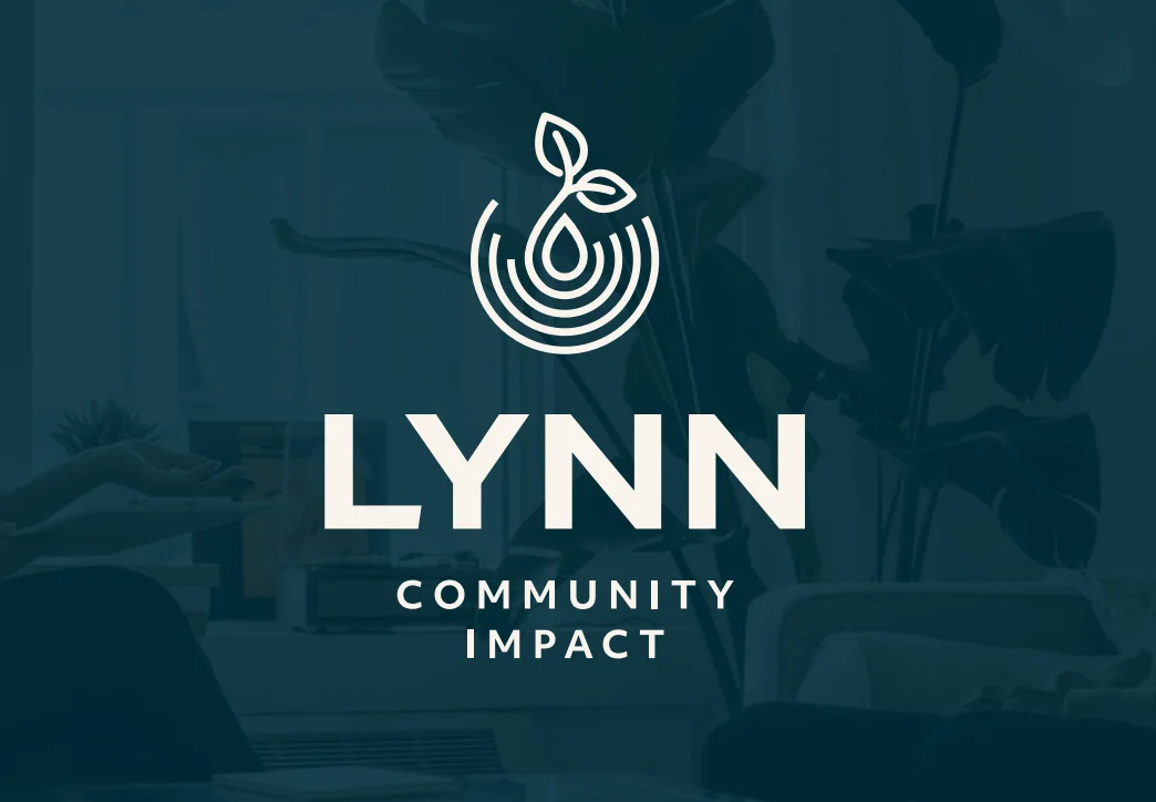
We have partnered with Lynn Institute since 2024, beginning with a website redesign, SEO strategy, and an automated event registration system. This year, they came to us with a bigger challenge: a full nonprofit rebrand that could match the organization they had become.
Their work had grown to encompass food security, health and wellness education, and support for at-risk youth. The former name carried history, but it no longer told the whole story. The new identity needed to preserve that legacy while making their community-centered mission immediately clear.
Case study summary
- Challenge
- The original Lynn Institute name no longer reflected the organization’s expanded community work across food security, health and wellness education, and youth mentorship.
- Solution
- The Mustard Seed Agency helped guide a full rebrand, including the new Lynn Community Impact name, visual identity, website redesign, redirect strategy, collateral, and launch communications.
- Outcome
- The new brand preserves the organization’s legacy while giving the community a clearer, more accurate understanding of its mission and impact.
The rebrand at a glance
- Renamed Lynn Institute as Lynn Community Impact while preserving the organization’s legacy name
- Built a flexible identity around wellness, trust, service, optimism, teaching, and collaborative impact
- Created a sprout-and-ripple mark that connects growth with the ripple effect of community work
- Carried the new brand into a redesigned website, collateral, and launch campaign
- Protected visitor access and search equity with redirects from the former domain
A mission bigger than the old name
The backstory
Lynn Institute had evolved beyond what its name suggested. The organization was not simply conducting research. It was actively advancing healthier, more connected communities across Oklahoma through education, gardening, mentorship, and direct support.
A successful rebrand could not erase that history. It needed to honor the trust already attached to “Lynn” while giving the organization room to communicate the full scope of its work.
Keeping the legacy, clarifying the impact
The strategy
The name Lynn Community Impact keeps the organization’s established name while making its purpose unmistakable. The strategy centered on six ideas the identity needed to express: wellness, trust and partnership, support and service, hope and optimism, nurturing and teaching, and collaborative impact.
Those ideas became a filter for every decision that followed, from the palette and typography to the logo and website messaging.
Behind the design: color
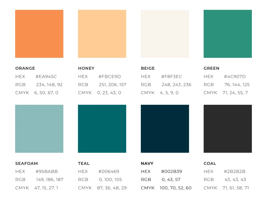
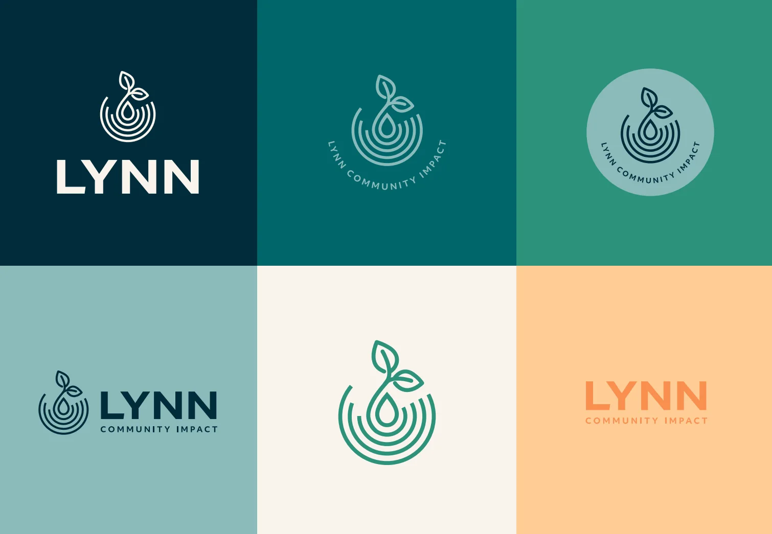
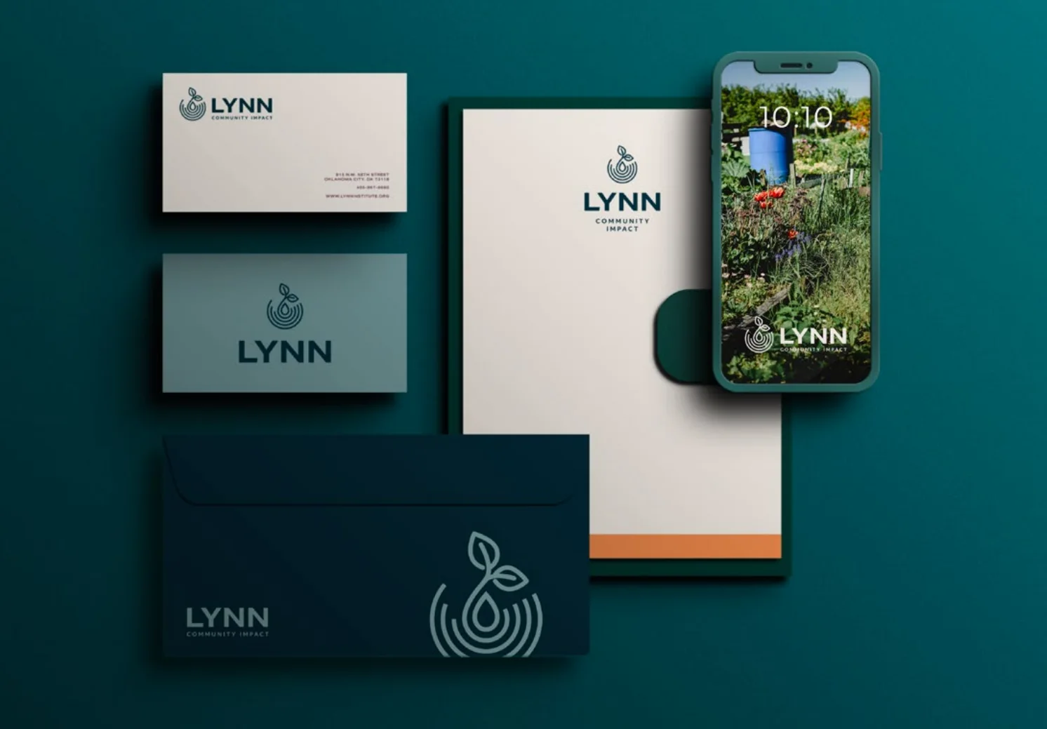
The final palette builds on Lynn’s familiar blue-and-orange foundation while expanding it with navy, teal, seafoam, green, beige, honey, and coal. Blues and teals lead the system, creating the trustworthy, professional feeling the team prioritized during onboarding. Orange is used more selectively as a warm, optimistic accent.
Green undertones connect the identity to nature and growth, while warm neutrals make the brighter colors feel grounded and approachable. Together, the palette gives Lynn Community Impact enough range to communicate wellness, service, hope, and community across digital and print applications.
Behind the design: the logo
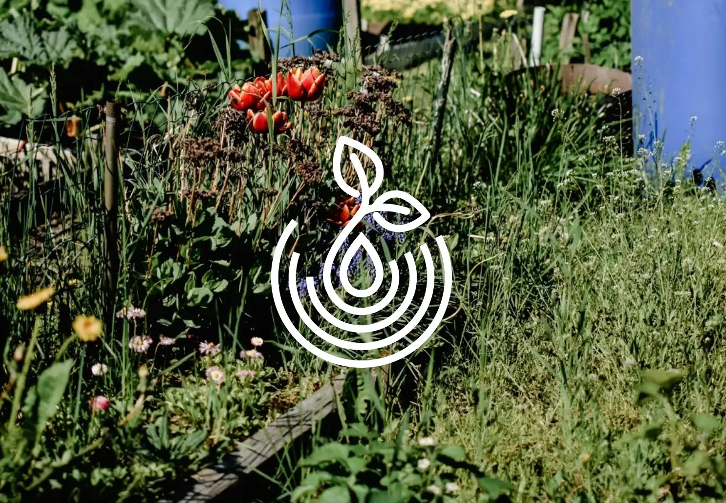
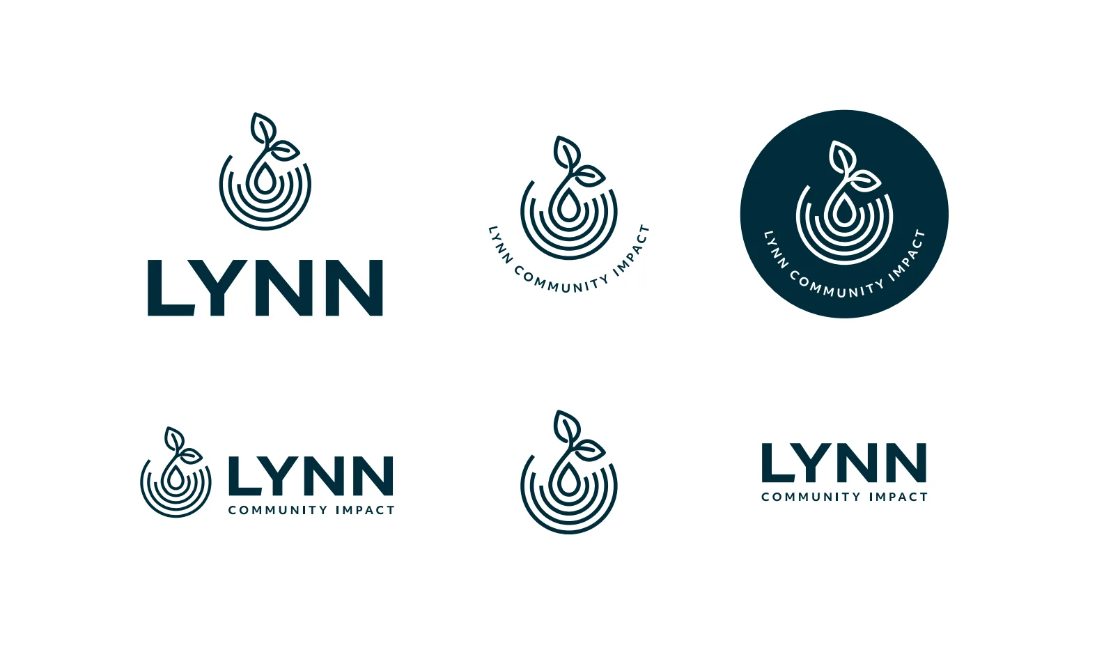
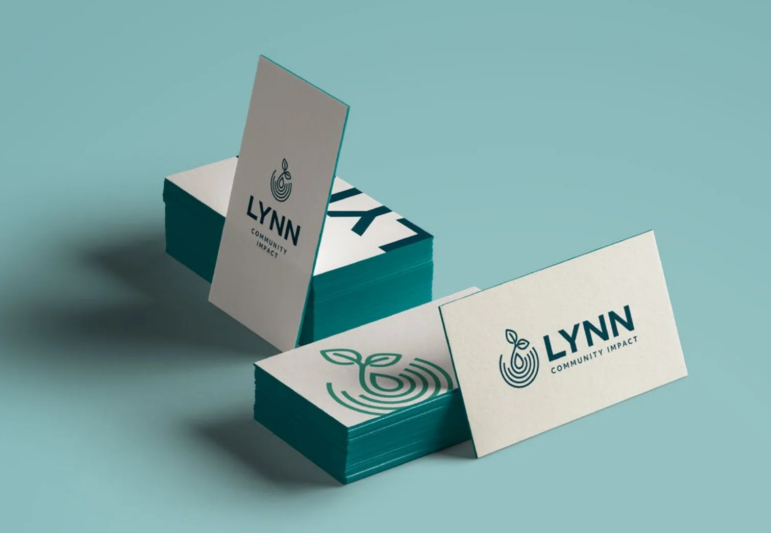
The final mark grew from the client’s idea of a water droplet creating ripples. A sprouting plant emerges from the droplet and rings, bringing together the ideas of growth and the ripple effect of community work. The simplified form feels balanced, hopeful, and purposeful while remaining recognizable at a wide range of sizes.
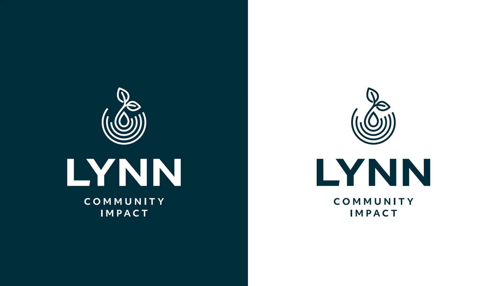
The complete logo family includes primary, horizontal, circular, wordmark, and standalone brandmark variations. That flexibility gives Lynn Community Impact a consistent identity across signs, social profiles, stationery, and smaller digital applications.
The full identity
The identity pairs Host Grotesk, a bold modern sans-serif, with Inter for clear, practical body copy. Libre Baskerville Italic adds warmth to quotes and callouts without competing with the primary type system.
The system was designed to work far beyond a single logo. Business cards, stationery, digital applications, and environmental graphics all use the same visual language so every touchpoint feels connected.
The website
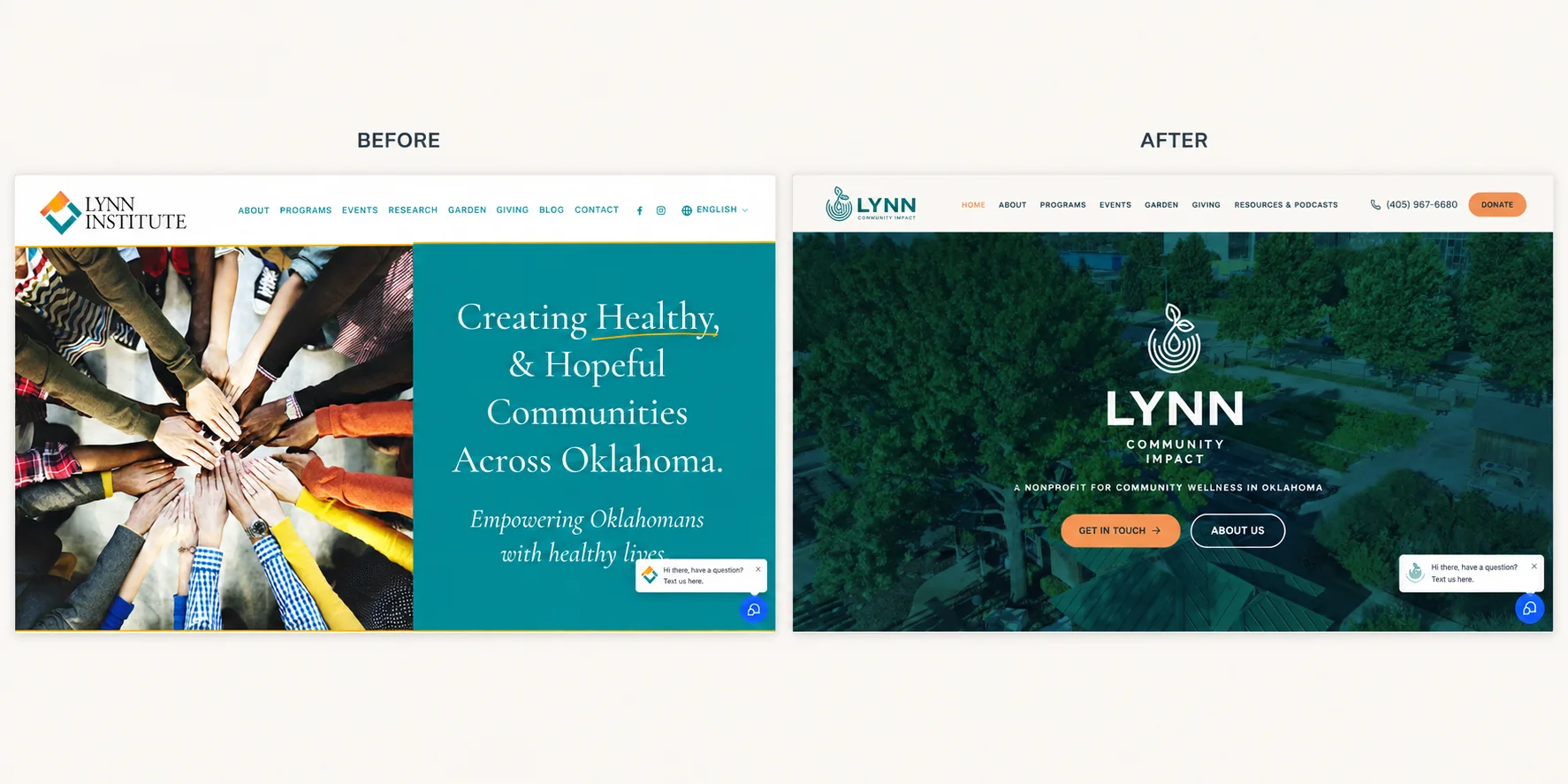
The new website carries the identity through consistently: the navy-and-teal foundation, the sprout mark, the warm orange accents, and messaging built around Lynn Community Impact’s three focus areas of food security, health and wellness education, and youth mentorship.
We also managed redirects from the former site and domain. That step matters whenever a business changes names or web addresses. Redirects send people using saved links to the right new page, prevent valuable pages from becoming dead ends, and help search engines connect the former URLs with their new destinations so accumulated search signals are not needlessly lost.
The result is a site that introduces the new name without making returning visitors start over.
Protecting what was already built
SEO considerations during a nonprofit rebrand
A new name changes how people find you, so the rebrand included a plan for the search side of the move. We redirected visitors from the former domain and site so saved links, shared posts, and older search results still land somewhere useful.
Important pages kept their place in the new site, which protects the credibility those pages had already earned and keeps donors, partners, and program participants from hitting dead ends. Consistent naming across the website, listings, and launch communications helps both people and search engines connect Lynn Institute with Lynn Community Impact rather than treating them as two separate organizations.
That combination of redirects, preserved content, and one consistent message is what keeps a name change from quietly costing an organization its visibility. It is the same groundwork behind every SEO strategy we build.
A coordinated launch
Getting the word out
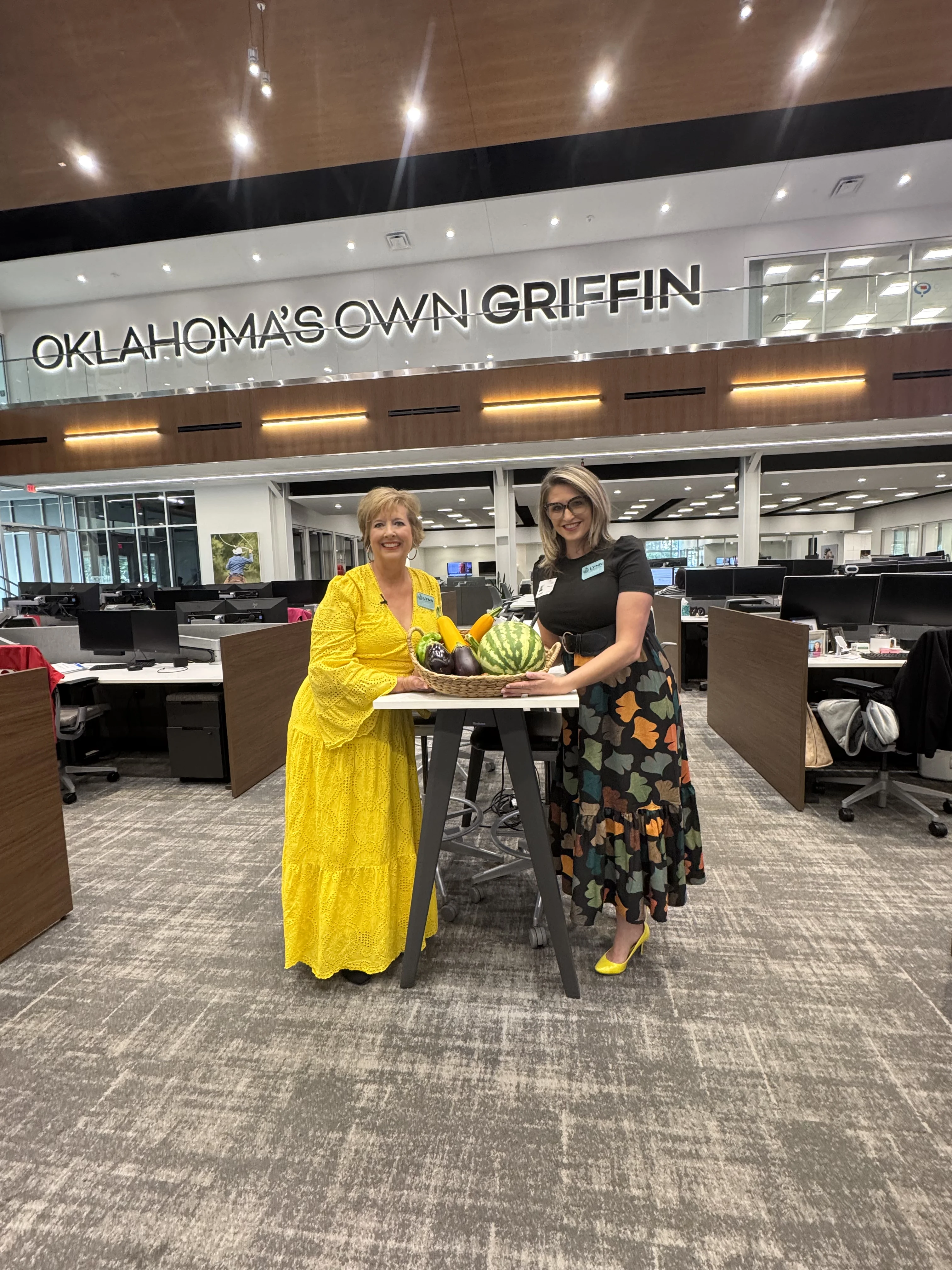
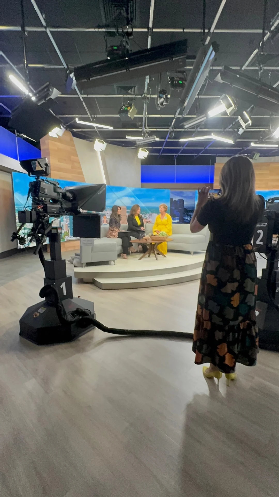
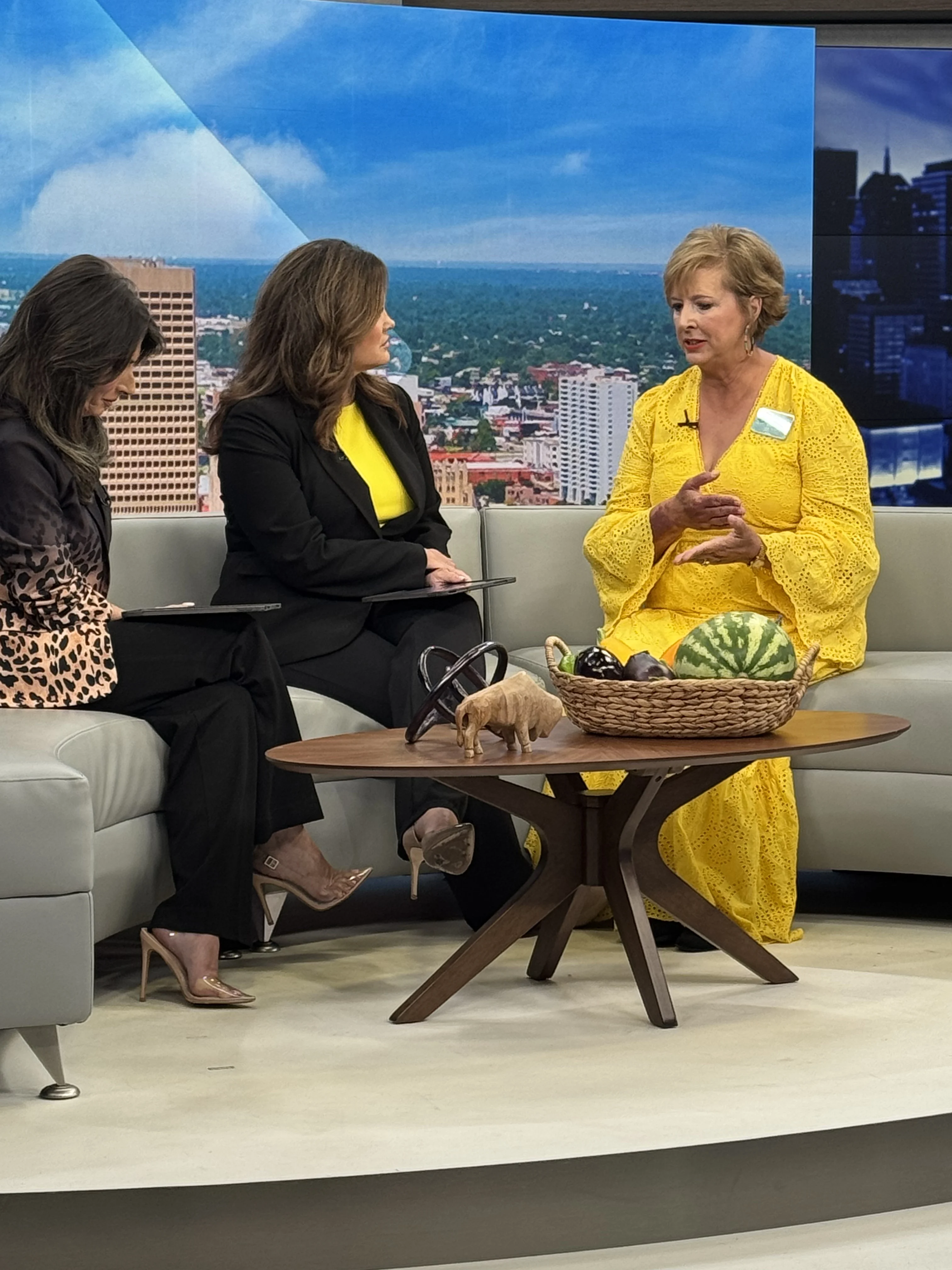
This rebrand wasn’t finished when the files were delivered. We partnered with Stacy at Kate & Steele on local public relations for the launch, helping Lynn Community Impact introduce the new name and explain the evolution behind it.
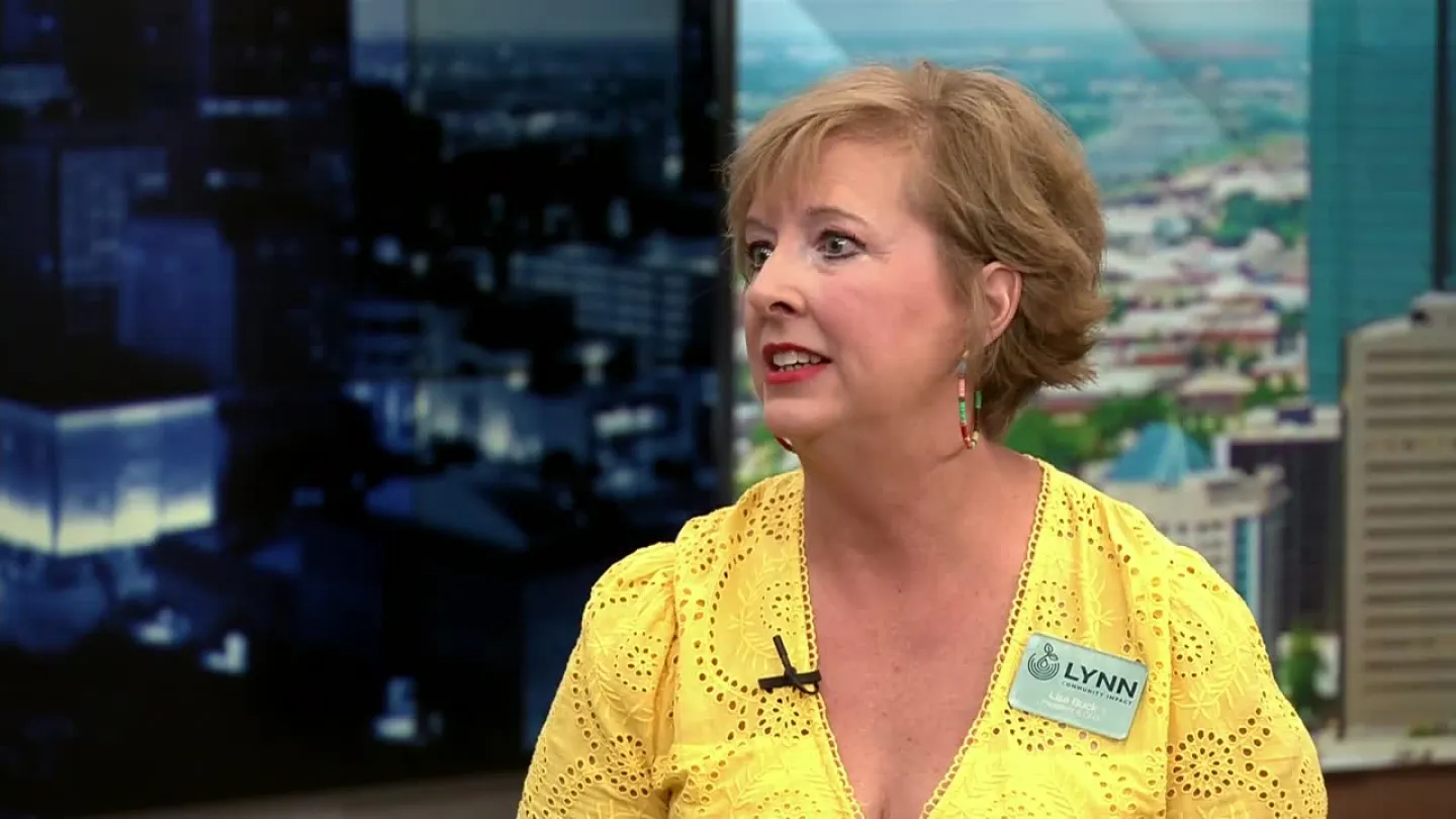
The rollout earned local coverage from News 9 and the Journal Record, extending the announcement beyond Lynn’s own channels and giving the community a clearer picture of what the organization is becoming.
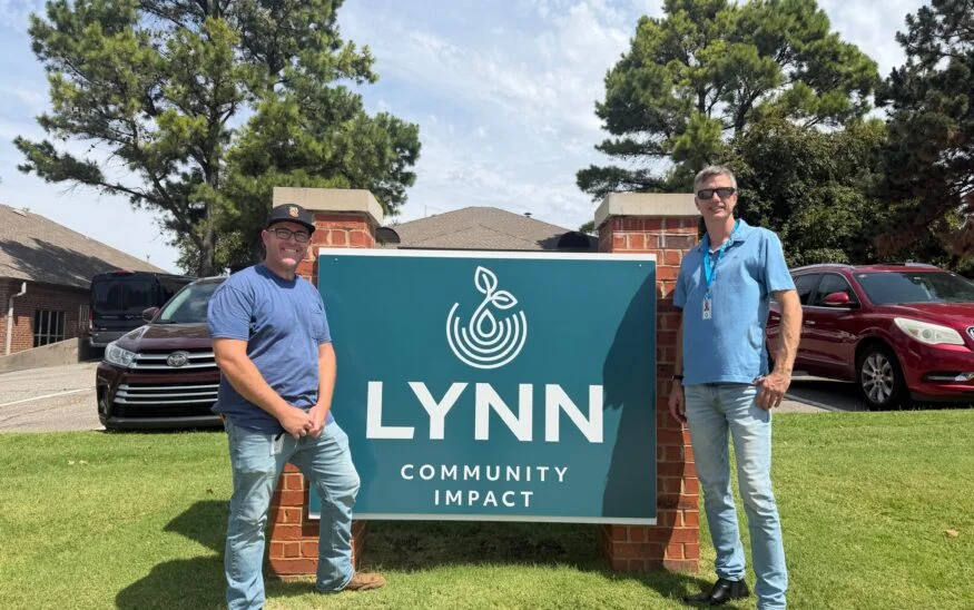
Behind the scenes
A word on the partnership
From the CEO
“Mustard Seed has been a beautiful partner in our rebranding transformation. They captured exactly what we were trying to accomplish in a fast, professional way, and then waited patiently for us to get everything in order on our end for the seamless roll out. We could not be happier with our partnership and outcomes thus far!”
Lisa Buck, CEO, Lynn Community Impact
Frequently asked questions
What is included in a nonprofit rebrand?
More than a logo. A full rebrand usually starts with strategy and audience clarity, then moves into the name, messaging, brand identity services like color, type and logo systems, collateral, a website redesign, and a launch plan so supporters hear the news from you first.
How do you handle SEO during a name change or rebrand?
Carefully, and before launch day. We map the old pages to new ones, put redirects in place from the former domain, keep the content that already earned trust, and make sure the new name is used consistently everywhere people and search engines look.
Why does brand clarity matter for nonprofits?
Nonprofits ask people for time, money, and trust. When the name and visuals make the mission immediately understandable, donors and partners spend their attention on the work instead of trying to figure out what the organization actually does.
When should a nonprofit consider rebranding?
When the work has outgrown the name, when programs have expanded, after a merger, or when the community consistently describes the organization differently than it describes itself. Those are all signs the story and the identity have drifted apart.
Facing a pivot in your own business or organization? A thoughtful rebrand can help your name, identity, website, and public story grow together.
Has your organization outgrown its brand?
Let’s build an identity that respects where you started and clearly communicates where you are going.